Wednesday, August 24, 2011

24082011

When you can't avoid something, learn to take it, adapt it, and slowly love it.”

-Unknown. A meaningful quote.

I did mentioned before in my first blog post that I actually dislike history. Moreover, the History of Art about the ancient paintings and sculptures failed to stir up my interest. Sometimes when Dr Ray requests us to blog more on the History of Art, I would sign in my blog, click on 'Create New Post', and stare at the screen blankly.

But today is somehow different. Probably because this is going to be my last post on History of Art for this semester.

That's why I decided to blog on something that I have not blogged before.

During this week's and last week's Monday lecture, Dr Ray showed us some famous artworks as usual, and most of them attracts me.

I've seen those paintings before!


*Back to Week 8*


When Ms Clare gave us the list of paintings for Assignment 3, I don't have a single clue on what piece I should choose. So I went to Mid Valley's MPH bookstore to look for some 'inspiration', and I found this book entitled “Living with Art”. It is a huge book, almost 500++ pages. Normally, I would just flip the first few pages and close it up, but I did not this time. I found a spot and flipped through the pages one by one, carrying a little hope of finding my choice of artwork inside this book.

Impression, Sunrise, by Claude Monet was the first painting that attracts me. Normally people will picture sunrise or sunset by drawing two mountains with a sun in between, adding a few two-stroke-birds on a blank paper. (At least this is what I do every time. Hehe.) But on this painting, Claude Monet uses anchoring ships at Le Havre harbor, France and 3 ships on the waters to portray sunrise. It is not a detailed painting, the strokes are applied randomly, and the colors used are just yellow and blue to mix out tones of green. Using bare eyes, I can see that there is a round, bright orange-yellow sun situated at the center left of the painting. However, it is amazing to know that if you duplicate this piece in black and white, you can hardly see the sun! The sun totally disappears from view. I immediately list it as my choice #1.

The second artwork that draws me to it is Las Meninas (The Maids of Honour). It is a very detailed painting, compared to my 1st choice of artwork. It pictures 9 person in a large room, with a dog at the doorway (bottom left). On the right hand side, there is a huge canvas, with the painter himself (Diego Velazquez) standing in front of it, probably in the middle of painting someone out of the 8 other person inside the room. It lets me wonder who is he actually painting? Research from Wikipedia shows that it could also be the two figures reflected in the mirror, King Philip IV and His Queen Mariana of Austria. This painting arouses my curiousity and I would like to do more research on it to know the complex meaning of it. Choice #2 it is.

The third detailed painting that really hit me is the Arnolfini Double Portrait. Painted with oil on canvas by Jan van Eyck, it is really fine work and detailed to a certain degree that I could hardly believe that it was actually painted using paint brushes and oil paint. It looks more like a photo to me! There is a detailed description of the artwork written on the book, about 2 to 3 pages long. It was stated that the Arnolfini Double Portrait is meant as a gift to the Arnolfini family in Italy. Well, I guess that is why the painting is drawn with such commitment. It sure took the painter a lot of time and effort to finish the whole painting. I can't imagine myself doing it, even for my best friend. First, because I am not that talented in painting. And second... Okay, I am lazy to do it. Haha.

After comparing the three paintings on my list, it took me a hard time to decide which one to choose. Considering that I will have to write an 1500 words essay, I finally chose the third painting, Arnolfini Double Portrait.

I really liked the book and thought of buying it. But... it costs RM 170++... Money is an issue to me. Uhh. If only I have the money...

Well thinking on the bright side, I can still borrow books like that from UTAR library. We really need a lot of references and secondary researches to complete the assignment. I have passed in mine last week, and is now waiting for my marks to be revealed on the next week. If I received good reviews, maybe I will consider to post it up on my blog.

Till then, I need to bid goodbye to my blog now and focus on the final exam dated on September 8. And the first paper is History of Art. I hope Dr Ray will not be too harsh on us because I don't want to get bad grades, Haha.

Thanks for reading!

_______________________________________________________________


References:

1. Mark, G. L. (2008). Living with Art. New York: Mc Graw Hill.

2. Impression, Sunrise. (n.d.). Retrieved August 24, 2011 from Wikipedia: http://en.wikipedia.org/wiki/Impression,_Sunrise

3. Las Meninas. (n.d.). Retrieved August 24, 2011 from Wikipedia:

http://en.wikipedia.org/wiki/Las_Meninas


4.
Arnolfini Portrait. (n.d.). Retrieved August 24, 2011, from
Wikipedia:

http://en.wikipedia.org/wiki/Arnolfini_Portrait

5. Impression, Sunrise [Oil on canvas]. (1872). Retrieved August 24, 2011 from Wikipedia:

http://en.wikipedia.org/wiki/File:Claude_Monet,_Impression,_soleil_levant,_1872.jpg


6. Las Meninas [Oil on canvas]. (
1656 ). Retrieved August 24, 2011 from Wikipedia:

http://upload.wikimedia.org/wikipedia/commons/thumb/3/31/Las_Meninas %2C_by_Diego_Vel%C3%A1zquez%2C_from_Prado_in_Google_Earth.jpg/300px- Las_Meninas%2C_by_Diego_Vel%C3%A1zquez%2C_from_Prado_in_Google_Earth.jpg


7.Arnolfini Double Portrait [Oil on wood]. (1434). Retrieved August 24, 2011, from Wikipedia:

http://en.wikipedia.org/wiki/File:Van_Eyck_-_Arnolfini_Portrait.jpg

Saturday, August 20, 2011

20082011.

Well, this post is basically a re-do version of the previous one, because I have included Islamic architecture as one of the buildings that relate to Greece. Added three more pictures. Hope I got it right this time! :)


1. Muzium Telekom
ionic straighter
Eastern G. Islands 6th BCE

2. Dragon Column Temple , Kuala Lumpur


3. Kuala Lumpur Stock Exchange (KLSE) Building

Doric , Greek culture

Thursday, July 14, 2011

14072011.

Group work: Discuss & Plan

Find 5 examples of Greek/ Classical/ Egyptian culture in Malaysia.
-Photograph and put up on all your websites
-Write 1 paragraph on website
-Why do you think people added this element?
-What is the purpose of it?
-What is its meaning here in this cultural context?
____________________________________________________________________


1. This is one of the famous shopping centres in Kuala Lumpur- Sunway Pyramid (left picture). From the name, it's obvious enough that this building contains the influence of Egyptian culture. Other than including the pyramid structure in this building, the person who built it also did not forget to combine it with a little touch of design by adding the large lion sculpture (sphinx) at the main entrance (right picture) of the building and smaller ones inside the building, and also Eygptian wall paintings. I was thinking maybe the person that built Sunway Pyramid wants to attract people to their shopping centre so they add the elements of Egyptian into the building. It's considered as a fresh and new idea in the field of architecture in Malaysia by the way, because no one has ever built something like that in Malaysia before.

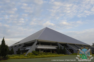
2. Kelab Golf Sarawak, East Malaysia (Sarawak Golf Club) is another building influenced by Egyptian culture. I think this is a form of kitsch because it's direct copying and mimicking of the Egypt pyramids. The builder just add some compartments below the pyramid structure... and change nothing else. I think this building is unoriginal, maybe the builder ran out of ideas? Hmmm.

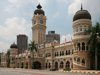
3. This is the Sultan Abdul Samad building in the Colonial District in Kuala Lumpur. This building adapted Greek culture because the colums used are Corinthian order. The builder did modify the building so that it won't look too alike with Greek architecture. Corinthian order looked more grand and nice on buildings compared to Doric and Ionic orders, therefore I think that's the reason that the builder add this Greek cultural icon in.

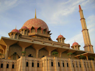
4. The Putra Mosque in Putra Jaya was found to have Greek elements on it too. The columns are in Doric form, simple yet expresses the building as a whole together with Muslim elements. The mosque looks a lot nicer with the columns supporting it. Whats more, people will not really question if this building is mimicking Greek culture because the columns blend quite well with the mosque itself.

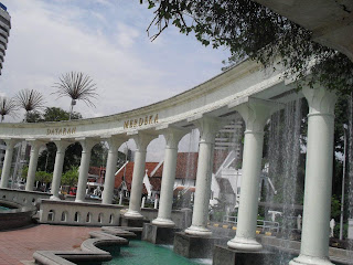
5. These columns are a part of Merdeka Square in Kuala Lumpur. Probably inspired by Greek culture, the builder add in Corinthian order to the columns, making the whole stucture look alike to Greek architecture. I think this is also a form of kitsch because he/ she copied the concept of Greek culture and put inside their building claiming it their own.

__________________________________________________________________________

Personally, I think that Classical and Egyptian culture indeed influenced many buildings in Malaysia. Some of the buildings looked really alike (a form of kitsch) whereas others are different in one way or another. In my opinion, original things are always good. No point to take the copyright of others and make it your own right? :)

Sunday, July 3, 2011

03072011.

This week's journal is all about the Principles of Organisation.

I recalled learning this in design fundamentals. There are 8 of 'em, namely:
1. Balance
2. Scale/ Proportion

3. Rhythm
4. Emphasis/ Dominance
5. Economy
6. Harmony
7. Variety
8. Unity

However, the list which Ms. Clare gave us is slightly different,:
1. Balance
2. Unity

3. Variety
4. Repetition
5. Scale
6. Proportion
7. Rhythm

8. Movement
9. Dominance
10. Economy
11. Elaboration


I've bold & italize the odd ones out. As you can see, Emphasis & Harmony does not appear in the new list; whereas Repetition, Movement & Elaboration are the new ones that I've not learned before.


We are required to do mind maps for all the 11 principles (continued from last week). And this week, I'm assigned to do the mind maps on Economy & Elaboration. I have no problem on Economy 'coz it's basically a recap on what we learned in foundation. But, I have not a single clue of what Elaboration is about.


Attached below are the 2 mind maps that I've done. Comments are welcomed :)


Come to think of it, have Dr. Ray received my e-mail? @@


Saturday, June 25, 2011

25062011.

Actually I should have blog about this like a few days ago, but there are just too many assignments jumbled up all together, and I had a hard time sorting them out. Hehe.

Well basically Dr. Ray requested us to read and report about one of the books listed below:
Oddysey, Koran, Upanishads, Beowolf, Illiad, Epic of Gilgamesh, Lao Tze, Confucious & Mencius, Old Testament, New Testament, Bhagavad Gita/ Mahabharata.

& Yeah, I chose Old Testament. Not because the fact that I'm a Christian, but because that I've never really get to finish the 39 books in the Old Testament. Due to time constraints, I've just finished the front part of Genesis.

"In the beginning, God created the heaven and the earth." This was Genesis Chapter 1:1

Many people don't believe in God, but they believe in miracles. This is silly because I believe that there is this one God that controlled the whole universe and that created us humans and make all the things around us to happen, including miracles. In Genesis it was also stated that the first two humans, Adam and Eve are created by God, which is totally different from the perspective of the scientists that proposed that humans evolved from monkeys.

Someone tell me then, if humans evolved from monkeys, then where did the monkeys come from???

Friday, June 24, 2011

24062011

Visual/ Research Journal Guidelines:

1. Prepare a Visual / Research Journal
2. You may conduct your research in a group (3-4 students in a group) and share your information with each other.
3. However, eventually every individual (student) must have their own journal. (Professor Ray has requested that you publish your research (findings) in your blogs)
4. All of your Research & Development must be in this visual journal.


Week 3: Weekly exercise/ research

What you need to do… Collect visual samples and categorise (name) those samples. Samples that correspond to: Line, Shape, Texture, Colour, Value.


Line


Shape


Texture


Colour


Value

Sunday, June 19, 2011

19062011

It's art criticism time! Our group chose van Gogh's painting this time. Enjoy! :)


Vincent van Gogh, Cafe Terrace at Night, 1888-09. Oil on canvas, 31.8 x 25.7 in (80.7 x 65.3 cm)


Description:

1. What is the credit line?
-A credit line is short list of essential information about a work of art. It consists of:

a. Name of the artist (in full).
-Vincent van Gogh
b. Title of the artwork.
-Cafe Terrance at Night
c. Year it was created.
-1888
d. Medium used by the artist. If there is more than one, it may be noted as “mixed media”.
-Oil on canvas.
e. Size of the artwork.
-80.7 cm x 65.3 cm (31.8 in x 25.7 in)

2. What do you see? What subject matter? What is happening in the picture (event)? Look closely.
-Stars, windows, round tables, chairs, buildings, tree, people, waiter, customer, doors, facade, night sky, yellow lantern, road, house, awning, paving stones, platform, street, shop, and walls.

3. What art ELEMENTS do you see?
-Line, shape, texture, colour, value

a. What lines dominate the artwork?
-The artwork dominates straight, curvy, and others such as horizontal, vertical, parallel, and implied line.
b. What shapes dominate the artwork?
-The artwork dominates organic shapes such as the table, awning and buildings.
c. What colours dominate the picture?
-The picture dominates cool colours such as yellow and blue.
d. Name the patterns/texture that you find.
-The patterns/texture that can be found in the art work is invented texture. For example, floor has a rough look.
e. What values dominate the artwork?
-The artwork dominates 2D value.


Analysis:
1. How has the picture (art elements) been arranged?
-Lines, shapes, and colours have been repeated in the picture.
2. How are the dominant lines arranged? Does it follow a particular direction? Are the lines repeated?
-The dominant lines are arranged vertically and it follows a particular direction.
3. How are the shapes arranged?
-The shapes are arranged asymmetrically, circular, grid and rectangle.
4. How are the colours arranged? Are the colours predominantly light or dark? Are they bright or dull? Is there a contrast in how the colours are arranged?
-The colours in the picture are predominantly 60% light and 40% dark. It’s bright. Yes.
5. How is the space arranged?
-The space is arranged overlapping and deep dimensional.

Technique:
1. How did the artist make this picture?
-Paint.
2. What materials did he/she use?
-Oil on canvas.
3. Why did he/she use that material?
-As seen in many of his drawings, he likes using paint.

Interpretation:
Subjective view
1. What does this painting mean to you?

-A peaceful night where people are out enjoying their drink at the cafe.
2. How do the colours make you feel? (mood)

-Cheerful.
3. How does it feel? (touch)

-Like rough wood.
4. How does it sounds?

-Like minuetto by Luiqi Boccherini.
5. How does it taste?

-Like wine (Sweet).
6. How does it smell?

-Like perfume.
7. Give this work a title.

–Belle night (A beautiful night). The painting was painted in Arles, French.
8. Are there any obvious symbols/icons that you see?

-Organic shapes.
9. What do you think the colours symbolize.
-Yellow: happy, cheerful.
-Dark blue: quiet, night sky.

Judgment:
Imitative and Emotionalism.

Audience:
1. Who commissioned this work? Purpose?
-He wrote to his sister to express his excitement and passionate.
2. Who would appreciate this work?
-Artistes and cafe lovers.
3. Why would the people you have indicated appreciate this work?
-This painting gives them a sense of happiness; the day ends with a beautiful night.

Commendations: What is successful about the piece?
Successful in the way that:
-The artist manages to express what he sees in his painting by accurately describing the event, objects and the people.

Recommendations: How would you improve it?
-I think that it need not be improved, because the painting is very well expressed.


___________________________________________________________________

Slowly realising that van Gogh likes to draw at night. I love to do things at night too. Probably because it's really quiet and peaceful during night time and I can focus more on my work. :)